A Practical Guide to Android App Icons: Adaptive Icons Explained (and How to Generate Yours Correctly)
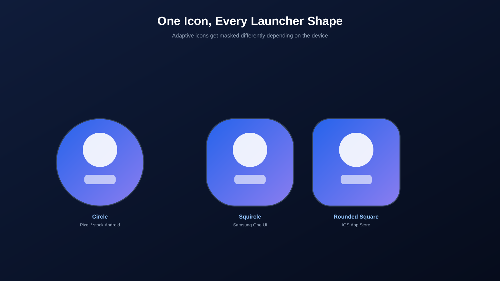
It's a common surprise for first-time Android developers: you polish a single square PNG for your app icon, export it at a tidy 512x512, and it looks perfect in your image editor. Then you install a debug build on a Samsung phone and the icon suddenly looks cropped and slightly off-center, as if part of the logo has been chopped away. Nothing is wrong with the file itself. The problem is that a single square image was never going to survive contact with the real world of Android launchers, each of which crops, masks, and reshapes icons differently. If you haven't run into this yet, it's only a matter of time before you do, so let's go through what's happening under the hood and how to get it right the first time.
Why a Single Square PNG Isn't Enough Anymore
In the earliest years of Android, app icons were exactly what they looked like: a single square (or occasionally free-shaped) PNG that every launcher displayed as-is. That worked fine until manufacturers started differentiating their phones visually, and one of the easiest places to do that was the home screen. Samsung wanted rounded squares, some Chinese OEM skins wanted different corner treatments, and stock Android eventually settled on circles. Suddenly, the exact same icon file looked noticeably different, and sometimes visibly worse, depending on whose phone it landed on.
Google's answer, introduced with Android 8.0 Oreo, was the adaptive icon system. Instead of supplying one fixed shape, developers provide layered artwork that the operating system itself masks into whatever shape a given launcher prefers. The visual identity stays consistent; only the outer silhouette changes.
What Exactly Is an Adaptive Icon?
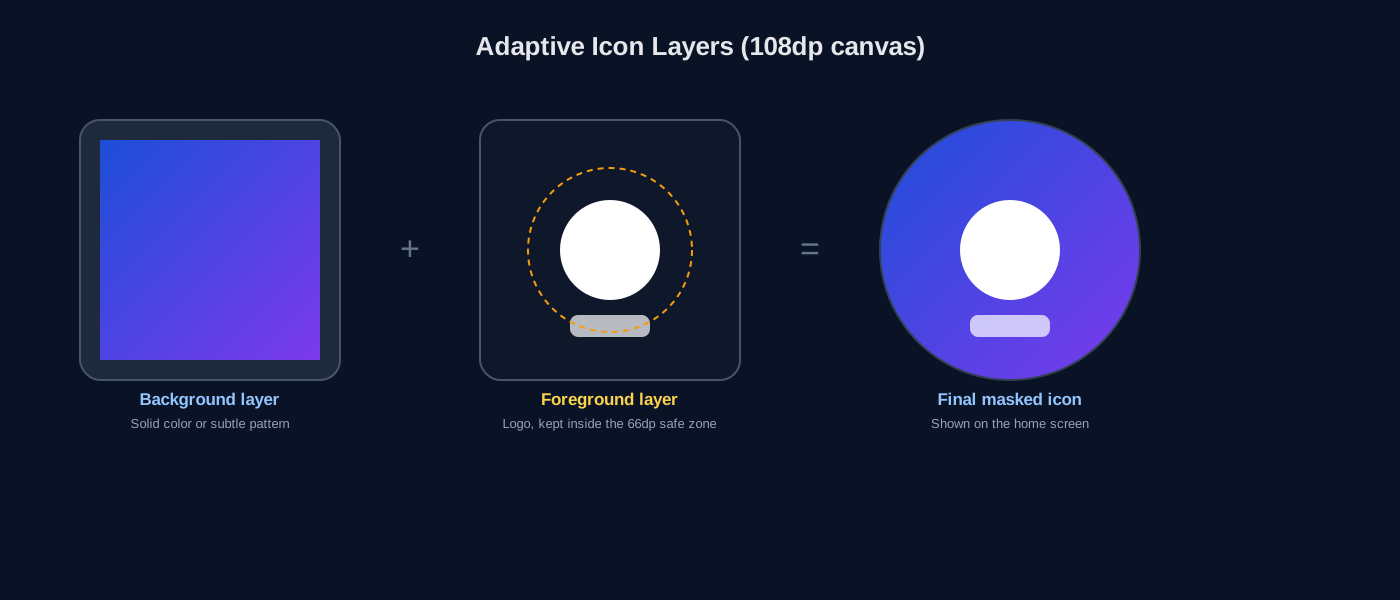
An adaptive icon is built from two separate layers, each occupying a 108dp by 108dp canvas: a background layer and a foreground layer. Android composites the two together and then applies whatever mask shape the current launcher uses, whether that's a circle, a rounded square, a teardrop, or something else entirely. The two-layer structure is what allows Android to add subtle parallax and motion effects too, since the layers can shift independently when you tap or drag an icon.
In an app's resources, this is usually defined through an XML file like mipmap-anydpi-v26/ic_launcher.xml, which simply points to the background and foreground drawables rather than containing pixel data itself. A traditional flat ic_launcher.png is still kept around as a fallback for devices running Android 7.1 or earlier, which predate the adaptive icon system entirely.
Why the Safe Zone Matters
Here's the part that trips people up the most. Even though the canvas for each layer is 108dp by 108dp, only the inner 66dp by 66dp circle, centered in that canvas, is guaranteed to be visible regardless of which mask shape gets applied. This inner region is commonly called the safe zone. Anything outside it might get shown on a circular mask and then abruptly clipped on a more aggressive squircle or teardrop mask, or vice versa.
This is exactly the kind of issue that shows up when a logo is drawn close to the edges of the canvas to maximize its visual size: it can look perfect on a circular mask but get clipped unevenly on Samsung's squircle mask. The fix isn't a redesign, just shrinking the artwork slightly so the meaningful content stays inside the safe zone no matter which shape ultimately gets applied.
Launcher Shapes You'll Encounter
| Shape | Where you'll see it |
|---|---|
| Circle | Stock Android, Pixel launcher (the long-standing default) |
| Squircle (rounded square) | Samsung One UI, and several other Android skins |
| Rounded square (superellipse) | iOS, applied automatically by the system with no developer control |
| Teardrop | Offered as a selectable option on some Samsung software versions |
| Square with soft corners | Various other manufacturer launcher skins |
The practical takeaway is that you don't get to choose which of these shapes your icon ends up wearing. Users on stock Android launchers can often even pick their preferred shape from a settings menu. Your only real lever is making sure the artwork itself survives all of them gracefully, which is exactly what the safe zone is there to guarantee.
Building the Assets: Sizes and Densities You Need
| Density bucket | Launcher icon size |
|---|---|
| mdpi | 48 x 48 px |
| hdpi | 72 x 72 px |
| xhdpi | 96 x 96 px |
| xxhdpi | 144 x 144 px |
| xxxhdpi | 192 x 192 px |
| Play Store listing icon | 512 x 512 px |
If you're also shipping the app on iOS, add another set entirely, since Apple's App Store icon requirements top out at 1024x1024 and use a completely different, non-layered format with no transparency at all.
The Manual Way vs Using a Generator
You can absolutely produce every one of these sizes by hand in an image editor, or through Android Studio's built-in Image Asset Studio, which handles the density scaling and mask previews reasonably well for a single project. Where this gets tedious is when you're maintaining a design system across several apps, need matching iOS exports from the same master artwork, or simply want a quick way to double-check how a design behaves across every shape before committing to it.
Generate every size from one master image
Our App Icon Generator takes a single high-resolution source image and produces the full set of Android density buckets, the adaptive icon foreground/background structure, and the Play Store listing size, all from one upload, so you're not manually exporting and renaming a dozen files by hand.
Extracting Icons From an Existing APK
Sometimes the need runs in the opposite direction. Maybe you inherited a project without its original design files, or you want to see exactly how a competitor structured their icon before designing your own, or you simply need to pull an icon back out of a built APK to reuse it in a related tool or marketing asset. Since an APK is effectively a structured archive containing all of an app's resources, its launcher icon files are physically present inside it and can be extracted directly, rather than reconstructed from scratch.
Our Icon Extractor pulls exactly these files out of any APK you upload, giving you the raw icon assets at whatever resolution the original developer shipped, which is often the fastest way to recover a lost source file or study how another app approached the same design problem.
Common Icon Mistakes That Get Flagged in Review
- Baking in extra padding or UI chrome. A drop shadow, border, or rounded-corner effect added manually inside the image conflicts with the system's own masking and often looks doubled-up or misaligned.
- Using a pure white background with no distinct edge. On light-themed launchers, the icon can become nearly invisible against the home screen background.
- Overly fine detail. Text and intricate linework that look sharp at 512px frequently turn into an unreadable smudge once scaled down to 48px, which is how most users see it day to day.
- A mismatch between the Play Store listing icon and the icon that installs. Reviewers and users both notice when these two don't match, and it reads as sloppy or, worse, suspicious.
- Forgetting the legacy fallback entirely. If your app still supports Android versions before 8.0, skipping the flat PNG fallback can leave those users with a broken or generic-looking icon.
Testing Your Icon Across Shapes Before You Ship
Before finalizing an icon, it's worth previewing it under at least a circular mask and a squircle mask side by side, rather than assuming it will translate cleanly. Android Studio's Image Asset Studio includes a live preview across several launcher shapes for exactly this reason, and it takes only a minute to catch an issue that would otherwise only surface after publishing, when a user on the "wrong" launcher shape reports back that something looks off.
Key Takeaways
- Adaptive icons use two layers, background and foreground, on a 108dp canvas, which the system masks into different shapes per launcher.
- Only the inner 66dp safe zone is guaranteed visible across every mask shape; keep meaningful artwork inside it.
- You still need a flat legacy icon for devices on Android 7.1 or earlier.
- A generator can produce every required density and the Play Store listing size from one master image, saving significant manual export work.
- Icons can be extracted directly from an existing APK when source files are lost or you need to study another app's assets.
Frequently Asked Questions
What's the actual pixel size required for a Play Store listing icon?
512x512 pixels, a 32-bit PNG with an alpha channel. This is separate from the launcher icon sizes bundled inside the APK itself.
Does my adaptive icon's background layer need to be a solid color?
Not necessarily a flat color, but it should generally be opaque and simple, since it can be shifted, scaled, or masked in ways you don't fully control. Busy or transparent backgrounds tend to look inconsistent across launchers.
Can I reuse my Android adaptive icon design directly for iOS?
Not directly. iOS uses a single flat square image with corner rounding applied by the system rather than separate layers, so you typically export a simplified flattened version of the same artwork for iOS.
Why does my icon look fine on my phone but blurry on the Play Store listing?
This usually happens when the listing icon was scaled up from a small source image. Always start from a master file of at least 1024x1024 pixels and export each required size down from that.
What happens if I skip the legacy icon fallback for older Android versions?
Devices on Android 7.1 or earlier, which don't support adaptive icons, may fall back to a generic system icon or render your icon incorrectly. It's safe to skip only if your app's minimum supported Android version is 8.0 or higher.
You don't need a background in design theory for any of this, just an awareness that your icon will be reshaped in ways you don't control the moment it leaves your hands. Design for the safe zone, keep a legacy fallback around, generate every required size from one clean master file, and your icon will hold up no matter which launcher it lands on.